One artwork, eight finishes
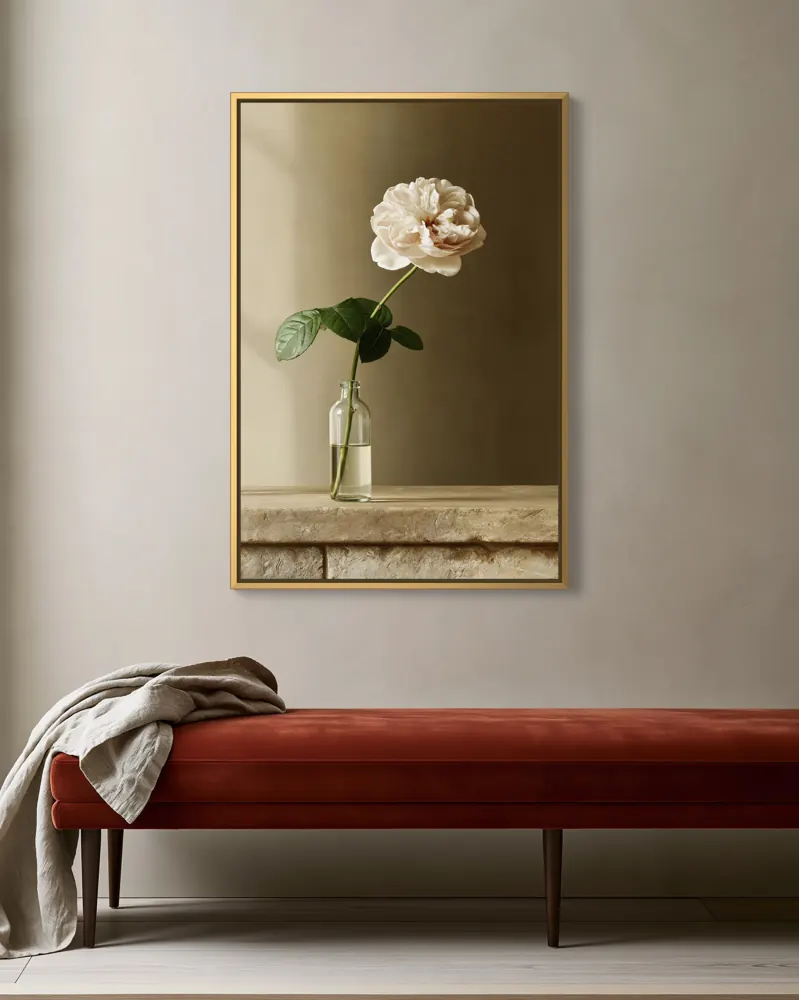
Look at how each finish changes the painting. Black sharpens the edges and deepens the blues. White makes it airy and modern. Natural oak and walnut warm it up. Gold makes it feel classic and a little formal, and silver cool and contemporary. The stretched canvas, with no frame at all, lets the image run to the edge.

Black: the safe, graphic choice
Black suits photography, line art, typography and high-contrast work, and it looks at home in modern, industrial and Scandinavian rooms. It also hides nothing: on a pale artwork a heavy black frame can dominate, so keep the frame slim for delicate pieces.
White: light and modern
White frames feel fresh in coastal, Scandinavian and nursery rooms. On a white wall they almost disappear, which can be lovely for soft artwork but weak for a hero image. Put white frames on a tinted or textured wall in at least one photo.
Natural oak, walnut and espresso: warm and natural
Natural oak is the most versatile finish for paintings, botanicals and landscapes, and it suits Japandi, boho and farmhouse rooms. Walnut and espresso are richer and darker: good with mid-century, moody and classic interiors, and with warm-toned art.
If you sell only one framed option, natural oak or black is the safest default; most buyers can picture either in their home.
Gold and silver: classic and cool
Gold frames suit traditional paintings, florals, still lifes and rooms with mouldings, fireplaces or deep wall colours. Silver suits cool palettes, black-and-white photography and contemporary rooms. Both are statement finishes: use them where the artwork is classic or the room is formal.
When to add a mat
A mat adds space around a print and makes small and detailed works feel important. It is standard for framed prints and photography. A white or off-white mat is the safe choice; our frame and mat calculator works out the opening and the frame size to order.

Choosing for a listing
Match the frame to the artwork first and the room second. Then show the finishes you actually sell, in the same room, so buyers compare like with like. If you sell several finishes, a single image with each option side by side, like the one above, answers the question before a buyer has to message you.
In WallMock, each room lists the products and finishes it offers, and you can save your favourite combinations to reuse for the whole collection.
Open the frame and mat calculator →
Questions sellers ask
What frame colour sells best for wall art?
There is no single answer, but black and natural oak are the safest defaults because they suit most artwork and most rooms. Choose by the artwork's palette and the buyer's likely interior.
Should the frame match the furniture?
It helps if the frame relates to something in the room, such as a wooden table or black light fittings, but it doesn't need to match exactly. Match the artwork first.
Is a gold frame old-fashioned?
Not with the right art. Thin gold floating frames look contemporary with abstracts and botanicals; ornate gold suits classic paintings.