Neutral rooms: your safest hero
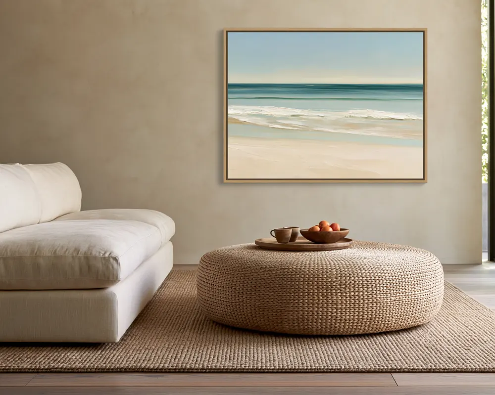
Warm white, cream, greige and sand walls flatter almost every artwork and look like many buyers' homes. Use them for the first image, where the artwork has to stand out in search.
Watch for low contrast: a pale, airy artwork on a pale wall can fade away. A frame (natural oak or black) or a mat helps separate it from the wall.
Tinted rooms: a gentle contrast
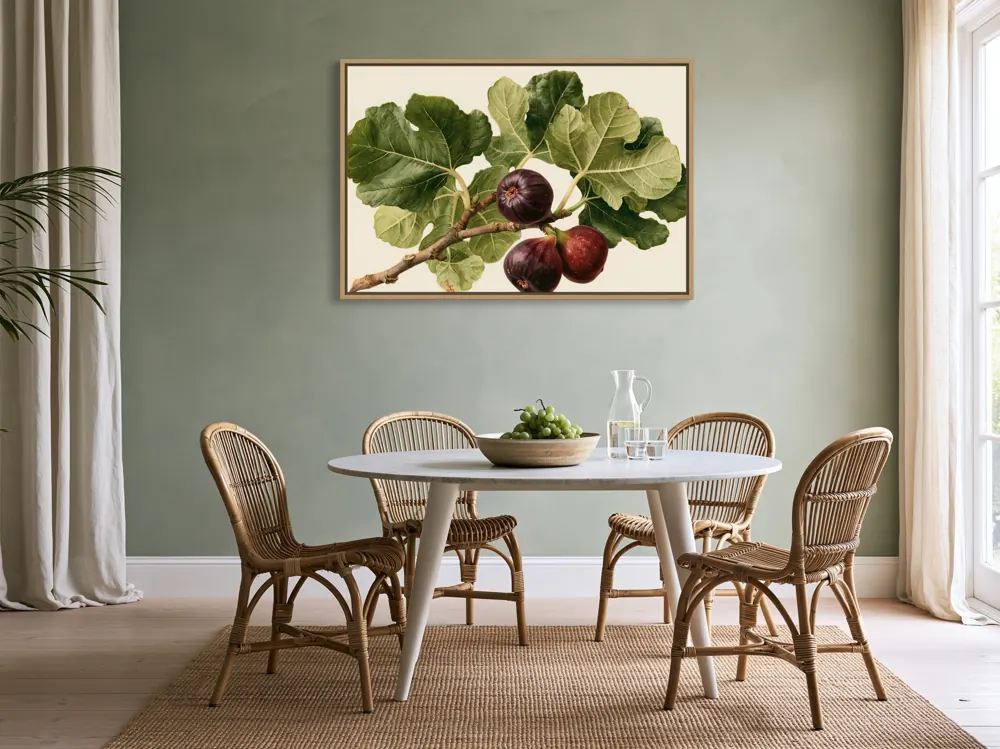
Soft sage, blue-grey, blush and pale lavender walls add mood without overpowering. Pick a tint that is opposite or next to the artwork's main colours on the colour wheel: a warm painting on a cool sage wall, or a blue seascape on a blush wall.
Bold rooms: for statement listings
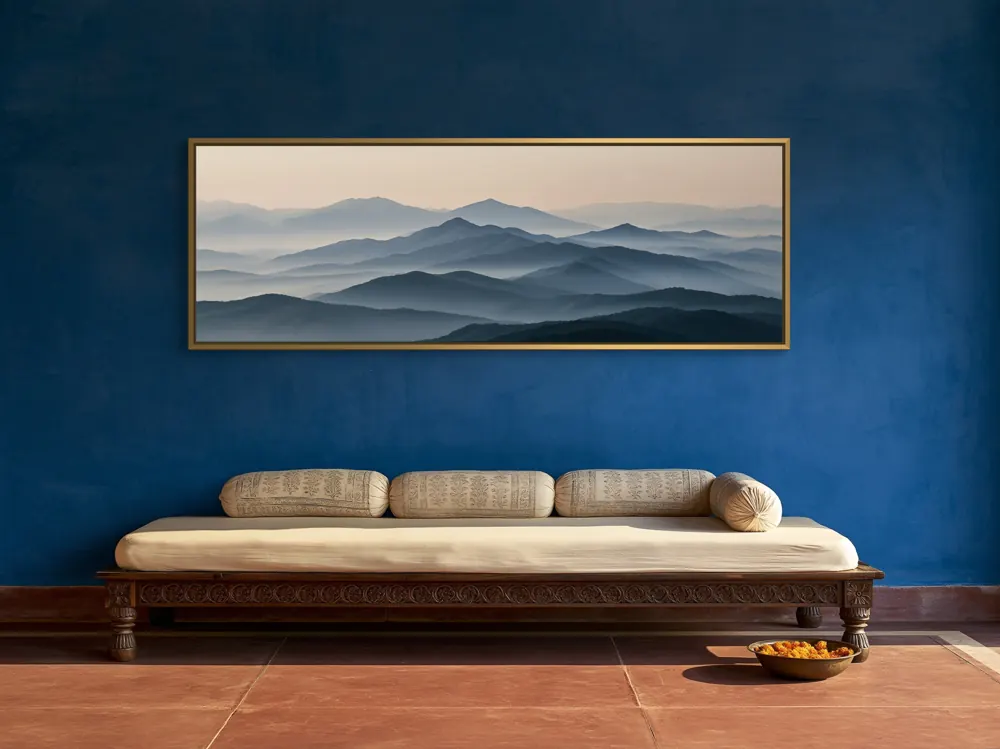
Deep green, navy, charcoal, burgundy and terracotta walls make light artwork glow and feel luxurious. Use one bold room per listing as an alternative image rather than the hero, unless your buyers love dramatic interiors.
A simple mix that works
For most listings, a mix of roughly six neutral rooms to two or three tinted ones and one bold one keeps a shop looking calm while still showing range. Change the mix for your niche: nursery art leans soft and light; moody botanicals can carry more dark rooms.
What we measured in 250 rooms
We measured the wall colour in the art area of each of WallMock's 250 reviewed rooms (CIE L*a*b*, median of the wall area in the room image). These are digitally staged interiors chosen for selling art, not a survey of real homes, but the pattern matches what sells:
- 166 of 250 walls (66%) are warm: cream, beige, sand, peach and terracotta tones.
- 50 walls (20%) are near-neutral greys and whites with almost no colour.
- 34 walls (14%) are cool: sage, blue, teal and blue-grey.
- 53 walls (21%) are dark enough to count as bold, deep rooms; the median wall is a mid-light tone.
In short: warm, light-to-mid walls carry most premium interior imagery, with cool and dark rooms used as accents. That is a good default mix for your own listings.
Match the interior style to the buyer
Scandinavian and Japandi rooms suit minimal line art, photography and abstracts. Boho and Mediterranean rooms suit warm, textured and botanical work. Classic rooms with mouldings suit traditional paintings and gold frames. Nurseries and kids' rooms suit playful prints and soft colours. Offices and cafés suit typography and graphic work.
Think about where the buyer lives, too. A haveli verandah or a Mediterranean villa might be exactly the kind of room your buyers recognise.
Browse WallMock's rooms by type to see which styles are available: living rooms, bedrooms, kitchens, bathrooms, nurseries and kids' rooms, dining rooms, entries and hallways, home offices and libraries, and café, hotel and studio spaces.
Questions sellers ask
What wall colour makes art stand out most?
Contrast: light art on a deep wall, or dark art on a light wall. For a first listing image, a warm neutral wall is the safest choice.
Should my mockup rooms match my brand?
A consistent palette of rooms makes a shop look coherent. Keep a few signature rooms and rotate alternatives around them.